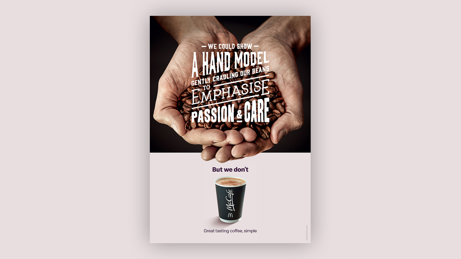
Already one of the best loved coffee brands in the UK, McDonald's wanted to remind people of the value and simplicity of McCafé. The concept was to poke fun at boutique coffee shops that charge customers a fortune for a Latte or Cappuccino, compared to the simplicity of great tasting coffee at a fair price. Our art direction was based around the proposition: "We could... but we don't". The design consisted of a split layout, with the top section containing artistic photography and type, and the bottom section a simple shot of a McCafé cup with the line "Great tasting coffee, simple". Typography was treated differently for each top section - with carefully crafted hand-drawn lettering, gold-foil type in a stacked layout and edgy tracked out letters. The bottom section, McCafé, always remained consistent and simple. These full page press ads ran in the Metro, Evening Standard and national newspapers and were adapted into various sizes and formats.
Client — McDonald’s UK
Agency — Leo Burnett London
Year — 2019
My Role — Lead Design
Creative Direction — James Millers, Andrew Long, Phil Bosher
Agency — Leo Burnett London
Year — 2019
My Role — Lead Design
Creative Direction — James Millers, Andrew Long, Phil Bosher