ASDA Brandworld
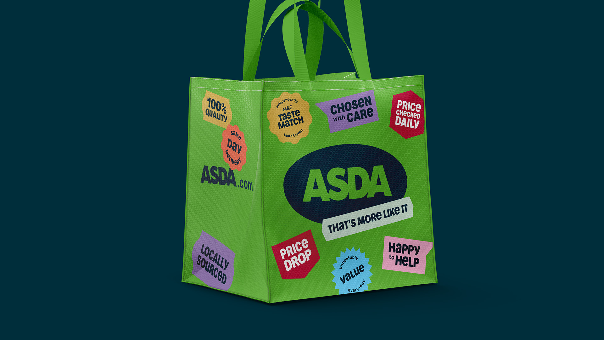
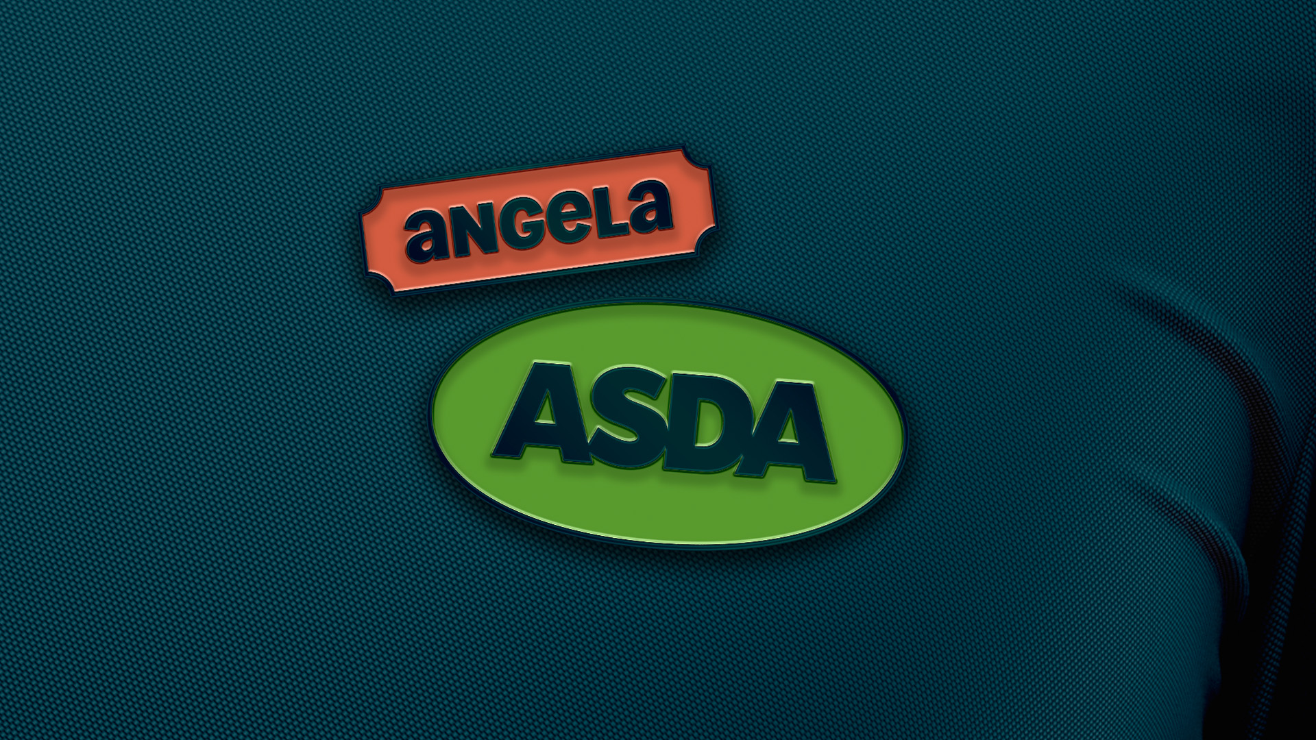
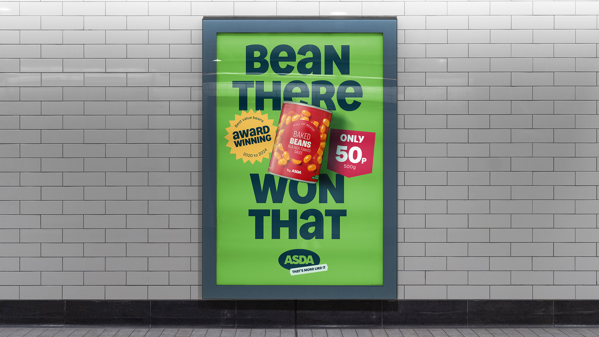
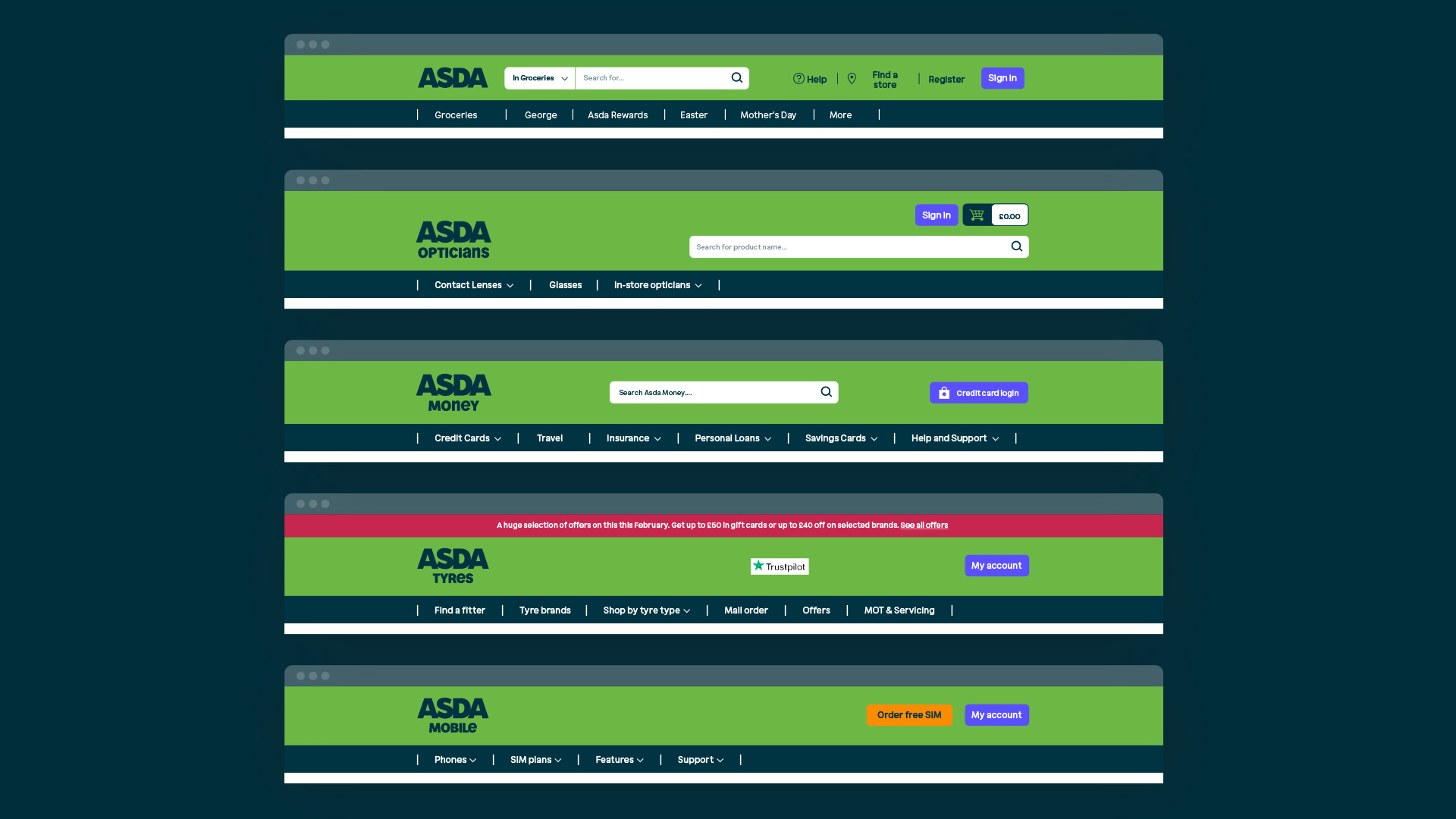
Refresh and realignment of ASDA's brand. Keeping the established logo, we introduced two complementary greens to express value and quality at the heart of all comms. A bold, warm and witty tone of voice came to life through a bespoke typeface and a graphic system inspired by grocer heritage, including fruit stickers and curved headlines. Rolled out across comms, in-store and online, it built a more personal brand putting people, value and quality first.
Project Type
Branding
My Role
Design, Creative